Introduction
Revive is designed for two main groups:
- Creative freelancers who are tired of working from home or generic co-working spaces
- Vinyl lovers who enjoy discovering new music in an authentic, analog way
The brand positions Revive as a cornerstone in Copenhagen’s creative community – a place where you can work, listen, mingle, and attend intimate events like DJ sets, listening sessions, and networking evenings.
I started the project by mapping out the shop’s role in the city, studying local co-working spaces and record shops, and defining how Revive could stand out by combining both worlds into one experience.
Presentation sheets made in Adobe InDesign
Mood Board
Concept: Nostalgic • Urban • Creative – meets – Brutalist • Gritty • Scandinavian minimal
The mood board blends:
• Copenhagen street life and independent record stores
• Concert posters and underground music culture
• Brutalist design references with bold type, simple shapes, and raw textures
The result is a visual direction that feels edgy yet approachable – perfect for freelancers, music lovers, and those who enjoy slightly unconventional, culture-driven spaces.
Tool: MilaNote

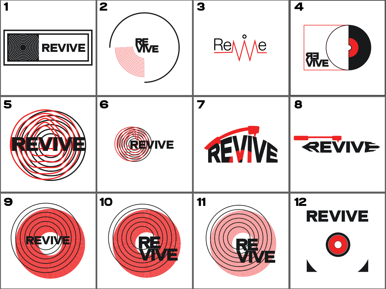
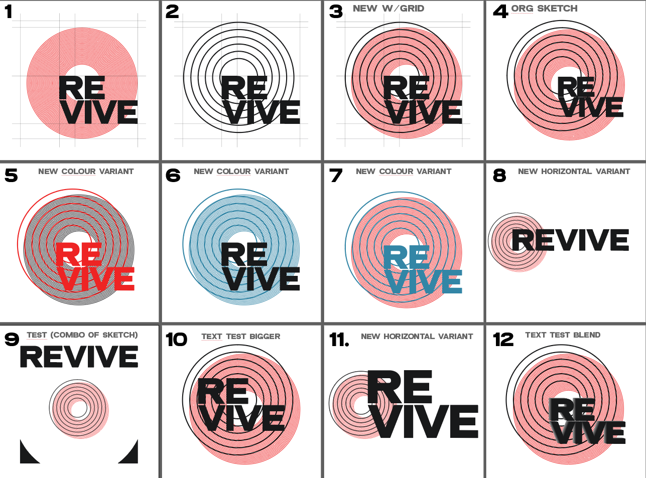
Logo Ideation
I began with word associations around “revive”, “rhythm”, “groove”, and “heartbeat”, then explored how these could connect to vinyl without being overly literal.
Key explorations included:
• Abstract vinyl shapes and groove-inspired circles
• A heartbeat / soundwave idea tied to the concept of “reviving”
• Textured shapes that mimic the look and feel of worn record surfaces
I created multiple variations in Adobe Illustrator, playing with blend modes, grain, and overlapping shapes. During feedback sessions with tutors, I narrowed the options down and refined the most promising direction, focusing on balance, readability, and flexibility across different formats.
Tool: Adobe Illustrator
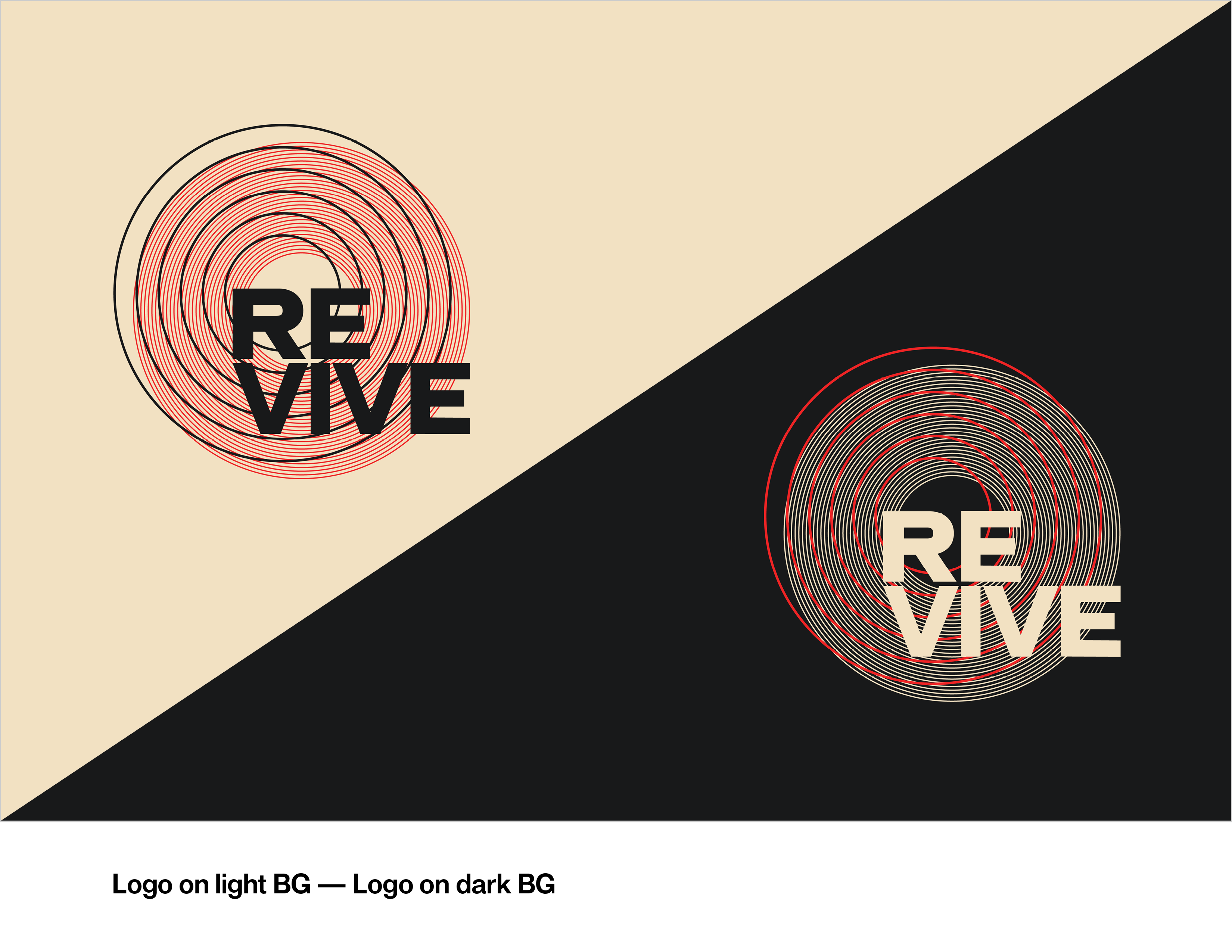
Final Logo
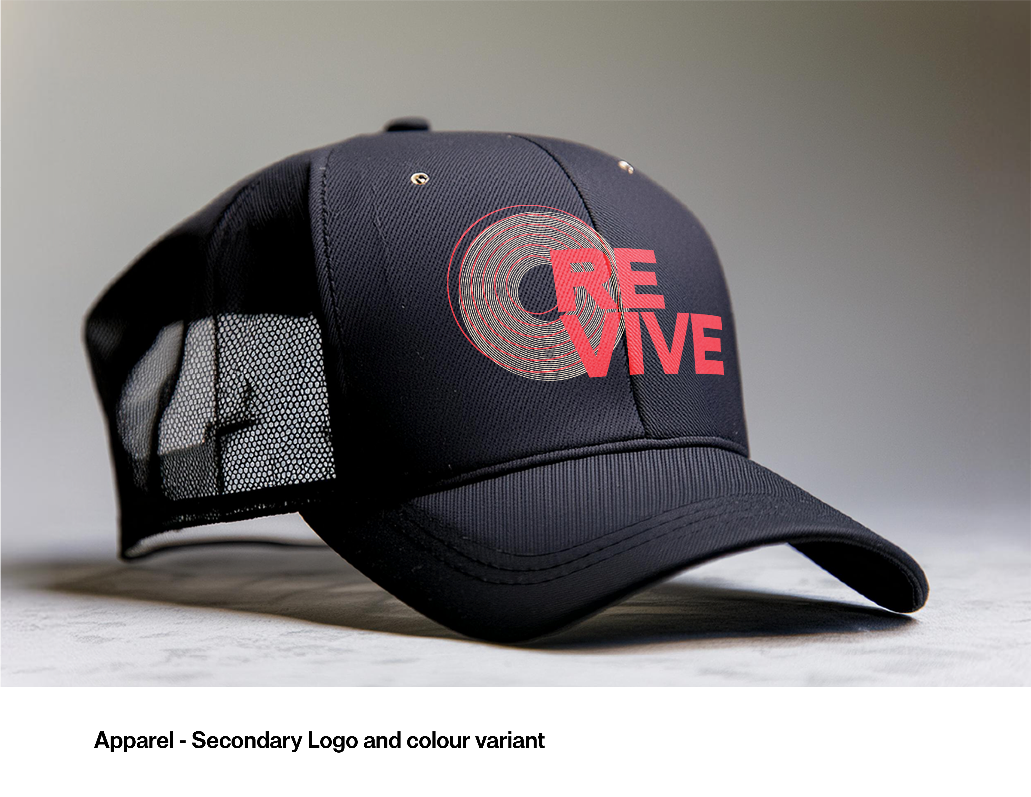
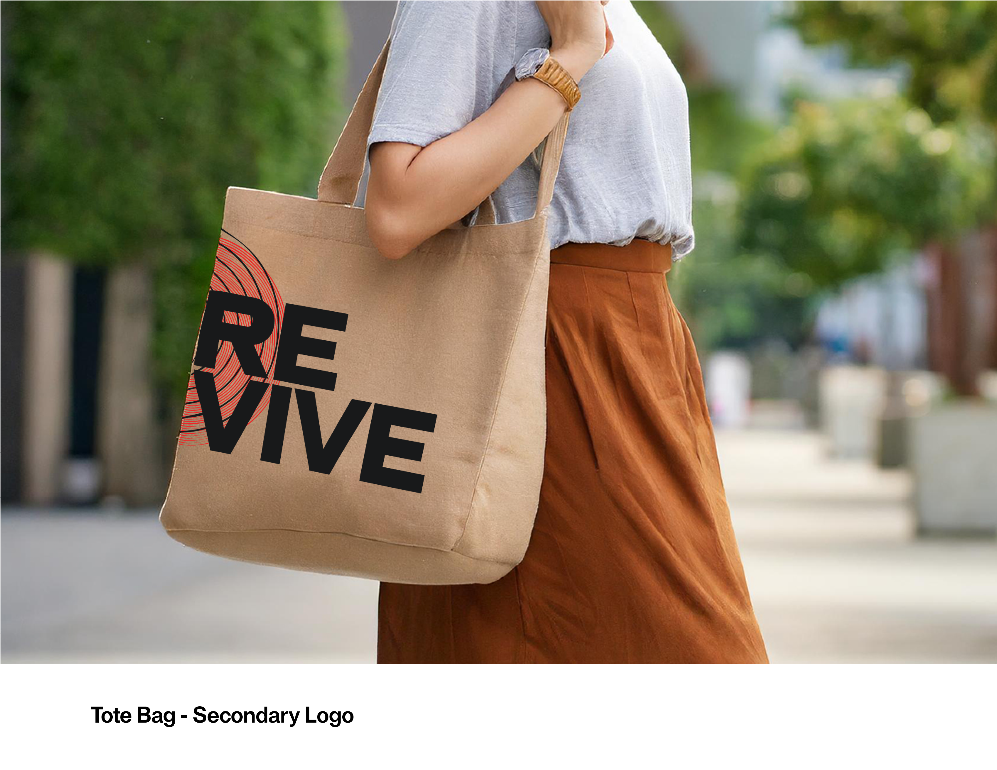
The final logo system consists of:
• A primary logo with the wordmark “Revive” combined with an abstract circular graphic that hints at both a vinyl record and sound waves
• A secondary logo/mark that works well in small spaces and on social media
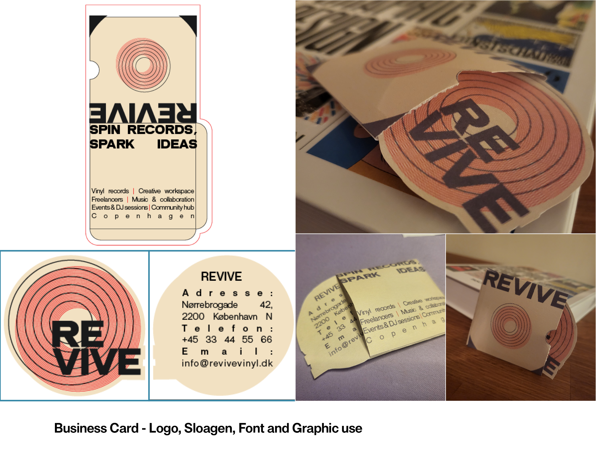
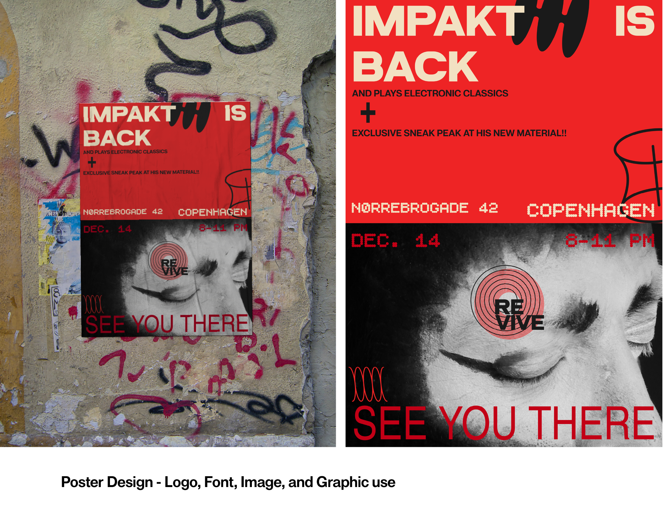
The logo feels bold, rhythmic, and energetic, while still staying clean and legible. It tells the story of vinyl and sound without relying on a cliché record icon. The use of geometry and grid-based alignment gives it a structured, modern look that fits the brutalist-inspired style of the overall identity.
Tool: Adobe Illustrator
Presentation sheets made in Adobe InDesign

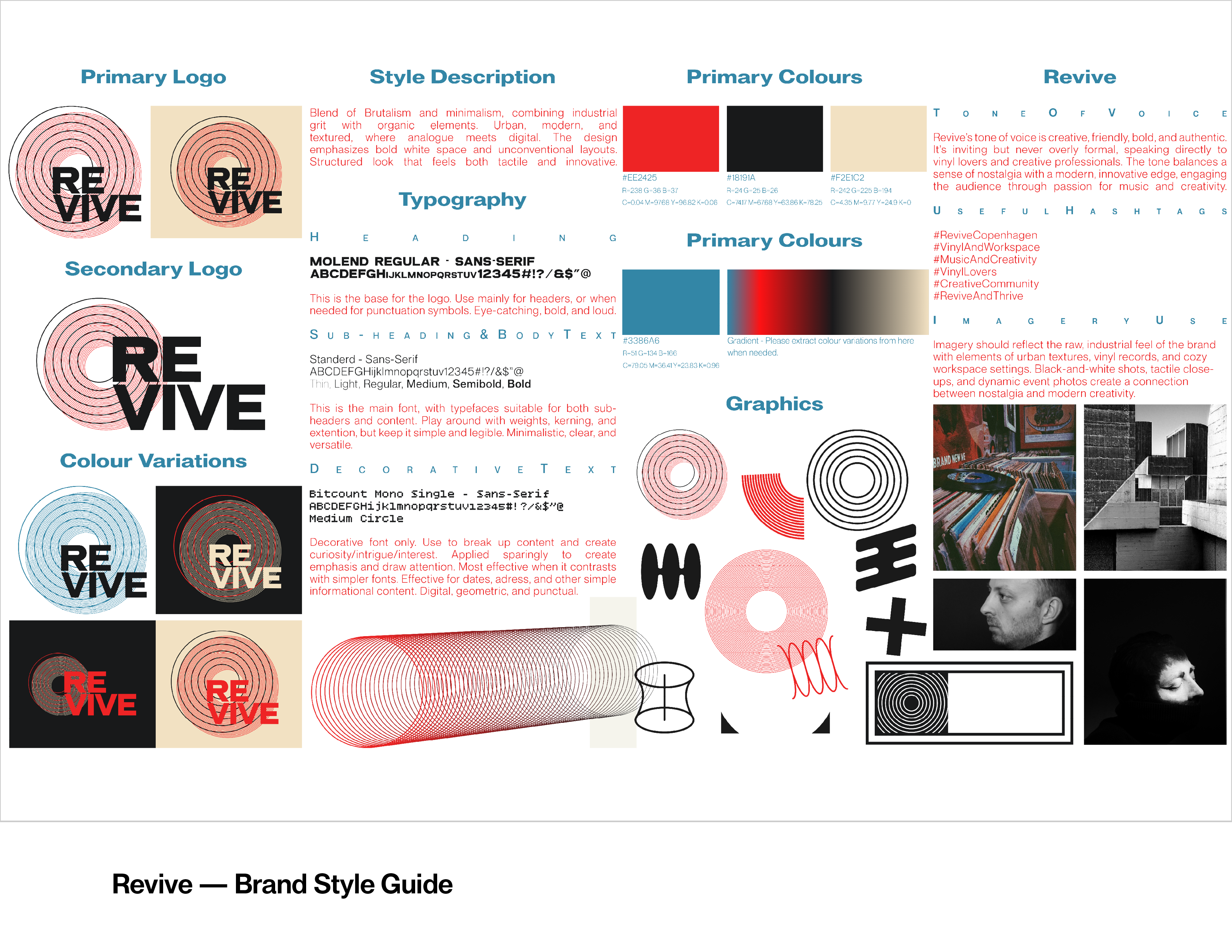
Brand Style Guide
The one-page Brand Style Guide defines the core elements of Revive’s identity:
Style: Brutalist-inspired, urban, and slightly raw – balanced with warmth and community-focused messaging
Color palette: A strong red paired with deep charcoal/black, an off-white with a warm tint for backgrounds, and a muted blue-grey as an accent. Together they create high contrast and an energetic, music-poster feel.
Typography:
• A heavy, wider grotesk display font for logo and headlines
• A clean, versatile sans-serif for body text
• Two more decorative typefaces used sparingly as character accents
The guide also introduces basic graphic elements, texture use, and tone of voice – friendly, creative, and laid-back, with a passion for music and community.
Tool: Adobe Illustrator and Adobe InDesign
Presentation sheets made in Adobe InDesign
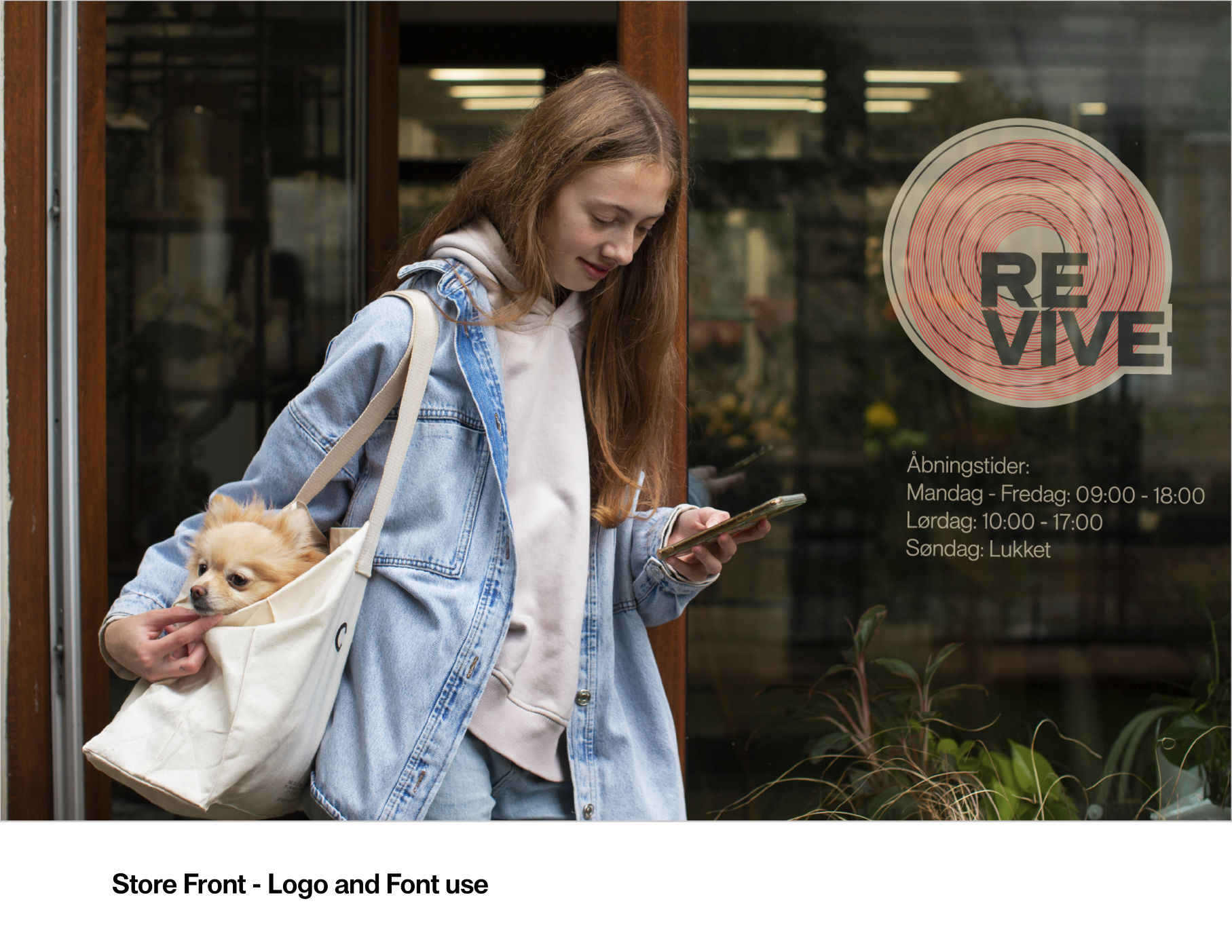
Mock Ups - Applied Branding
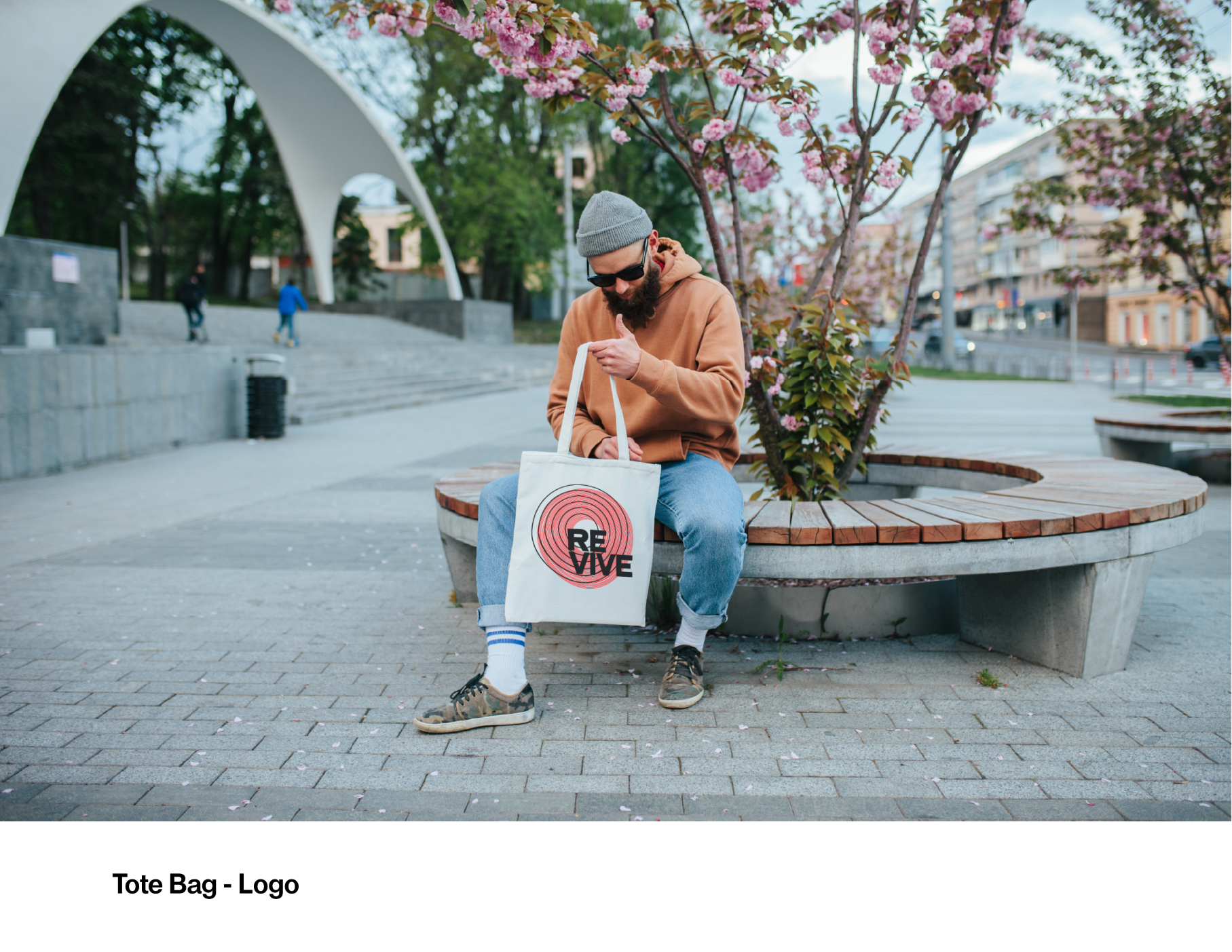
To bring the identity into real-world scenarios, I created a series of mock ups showing how Revive could live both physically and digitally. Examples include:
• Posters and flyers for events, DJ nights, and listening sessions
• Business cards designed like mini vinyl sleeves, with the logo and contact details as a “record” inside
• Storefront applications, signage, and record sleeves
• Social media content, using the brand’s colours, typography, and graphic elements to promote events and new arrivals
These touchpoints demonstrate how the brutalist-inspired visuals can scale from print to digital while still feeling cohesive, recognizable, and flexible.
Tool: Adobe Photoshop, Adobe Illustrator, and standard at home printer
Presentation sheets made in Adobe InDesign
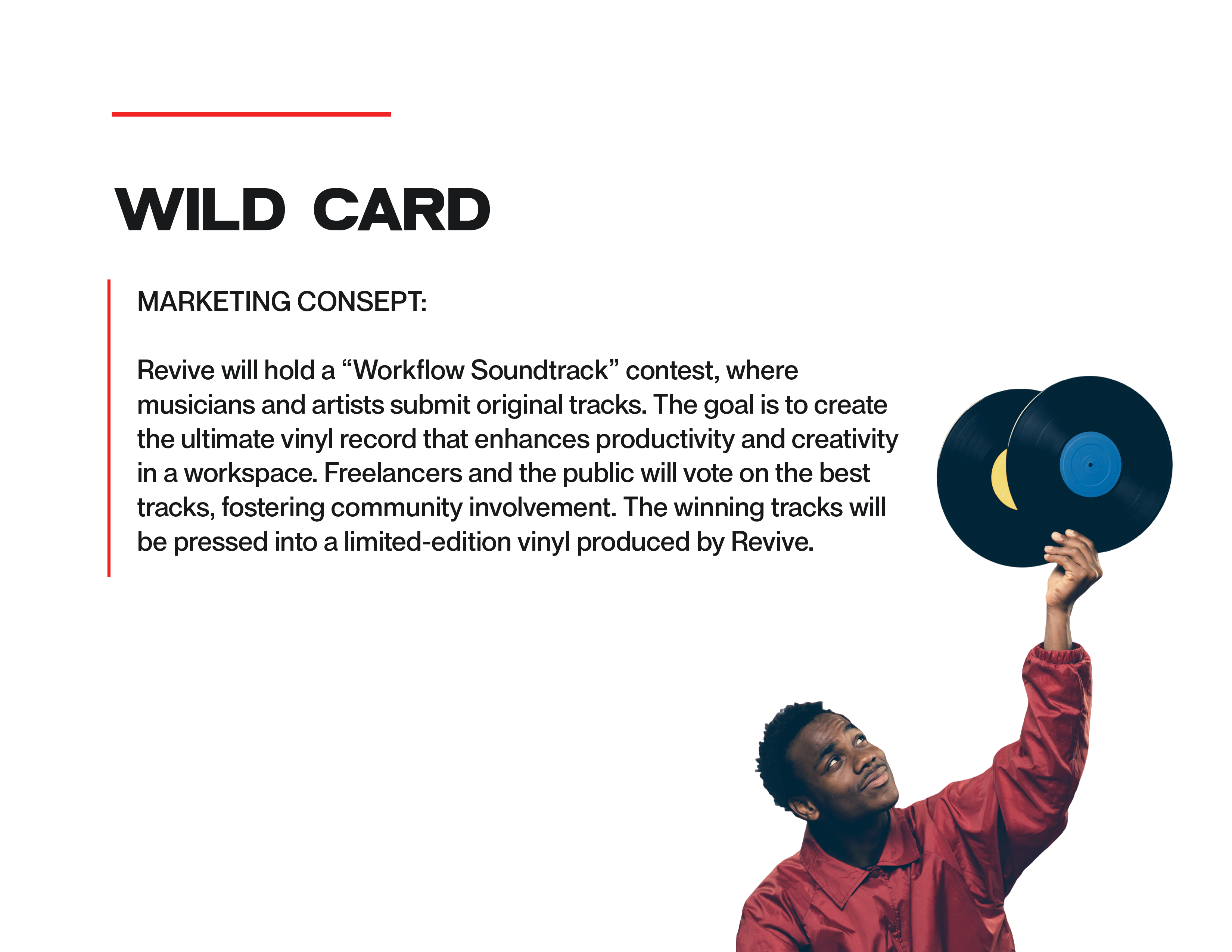
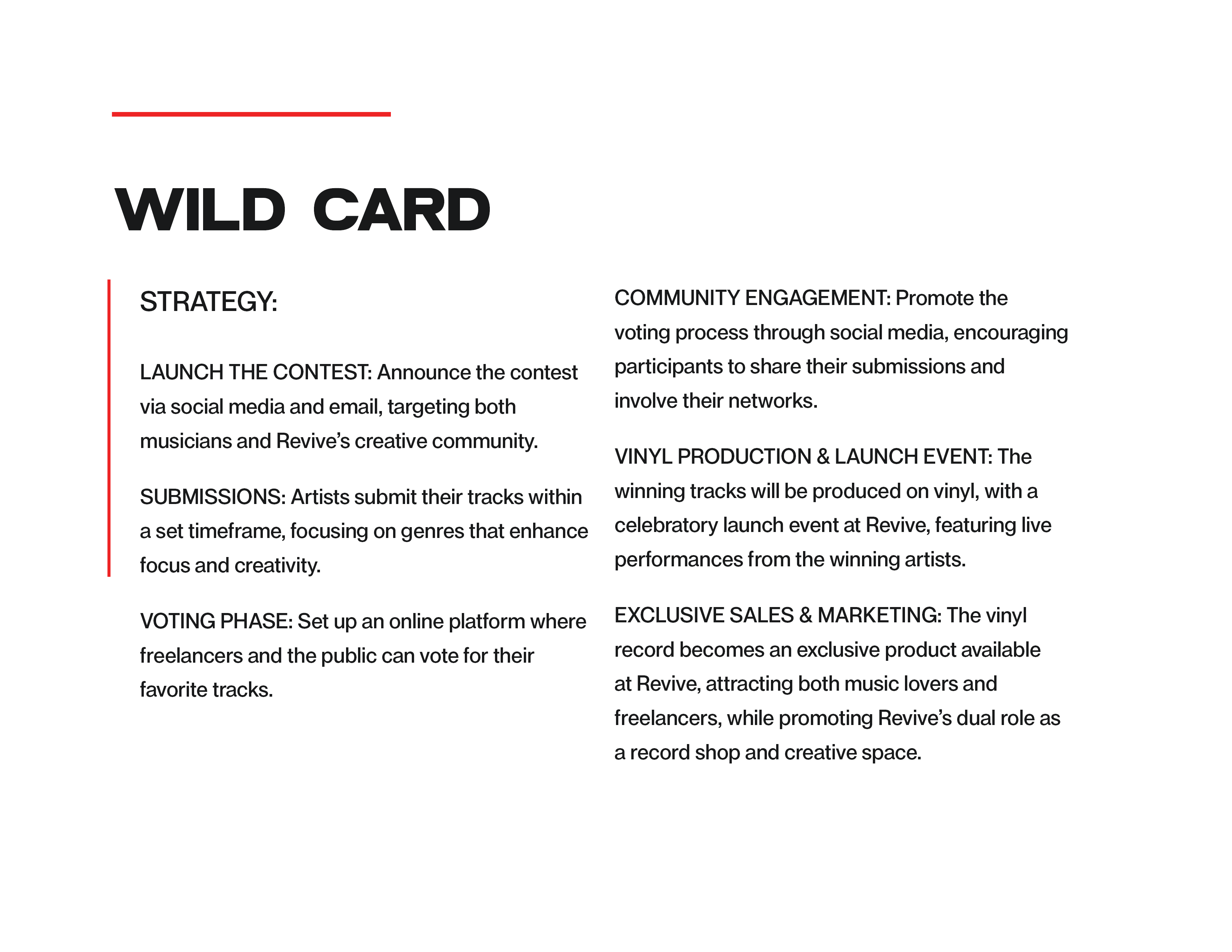
Wild Card - Branding strategy
For the Wild Card, I developed a community-driven concept:
A music competition for local artists to co-create the ultimate “workflow” album.
• Local musicians are invited to submit tracks designed for focus, creativity, and deep work.
• Revive’s community – especially freelancers – vote for their favourites.
• The winning tracks are pressed into a limited edition compilation vinyl, released exclusively through Revive.
This idea helps:
• Promote Revive as a creative hub, not just a shop
• Give local artists a platform and real, tangible output
• Create a unique product that aligns perfectly with the brand’s mission: music that supports creative work
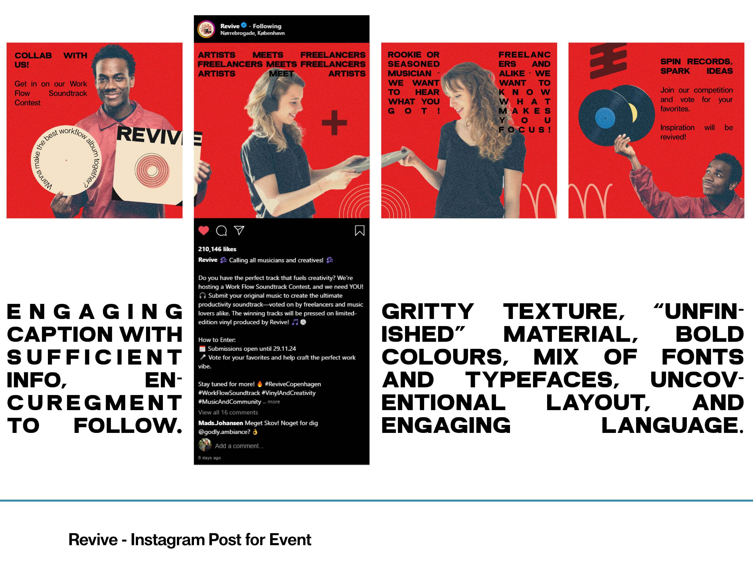
The concept is then visualised through social media posts and mock ups that show how the campaign could roll out across Revive’s channels and in-store.
Tool: Adobe Illustrator. Adobe InDesign, and Adobe Photoshop
Presentation sheets made in Adobe InDesign